Ideation with Claude AI
While I mull over the idea for my travel application in my head, I’m working on something unrelated but (hopefully) simpler. This is also an opportunity to test Claude Code. I like Kagi, but their AI Assistant is quite rudimentary in terms of user experience. Claude lets you create projects so your conversations are not all over the place. Also, Claude Code being now available on the web and as an extension with Visual Code is maybe a good replacement for Replit? In a nutshell, it simplifies (and is cheaper) to have one tool instead of 2 or 3.
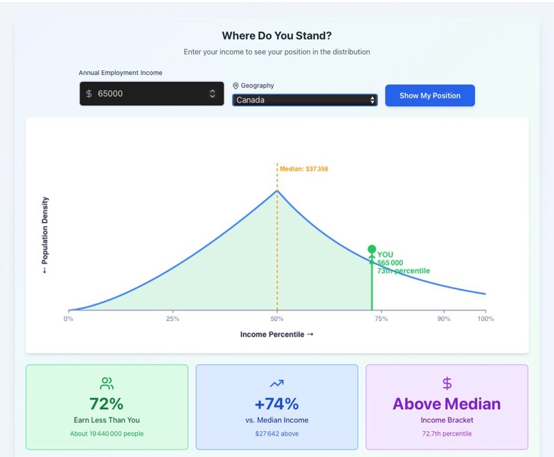
The idea is to show the user his or her position in the distribution of incomes in Canada. It came after several chats with friends about inequality in terms of wealth and salaries. I’m not sure that everyone has really a good grasp of his or her standing in the scale of incomes.
I created a project with Claude, and I uploaded a file from the Statistics Canada website (households income survey), and I started asking questions to explore the domain.
I want the website to be very simple and also crystal clear on the numbers presented. Most people know only one number: their gross annual salary, i.e. before taxes and other deductions are made.
That’s where the AI can shine: it’s easy to ask questions, request clarifications, etc. I learn a lot about the way they (Stats Canada) are collecting the data, the different terms and aggregations made. I was able to test also the « research » mode of Claude. While it takes longer to provide an answer (~12-15 minutes), it avoids some earlier mistakes about the numbers extracted.
It also made me think about what I read a few weeks ago : AI tools are very good when you are already an expert or at least have some prior knowledge; otherwise, you have to be careful and go one step at a time.
At the end, I asked it to list 10 different ideas to visualize the results, and I picked one to test it (see below). It’s not really what I want, but it’s a good starting point.
Update
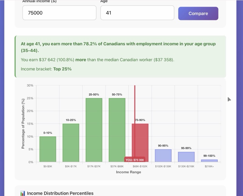
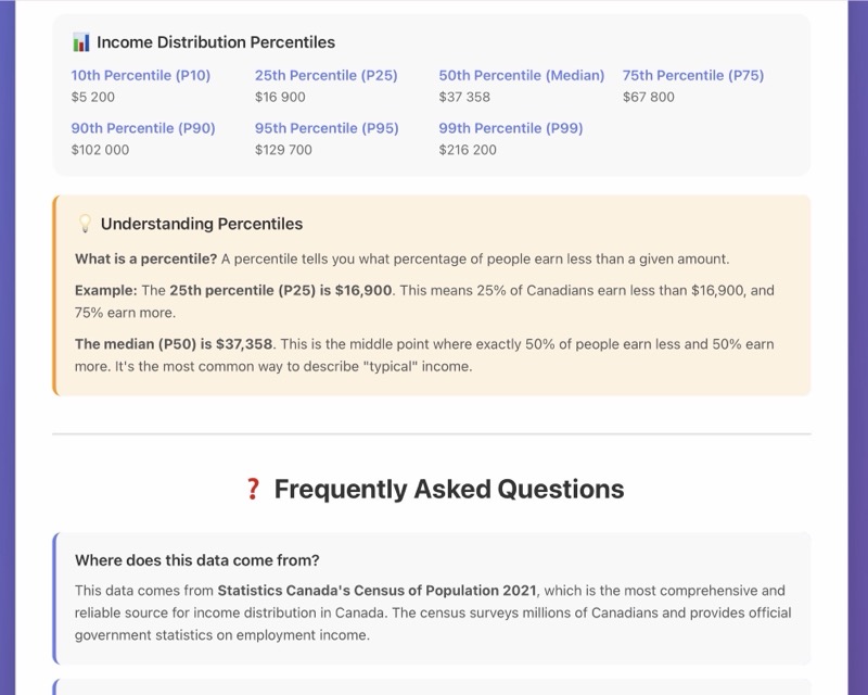
I’m continuing my exploration about building an illustration of one position in the distribution of incomes in Canada. Since the aggregate data is not available, the simplest way to find it is by asking the gross income and the age of the person.
I have not yet tweaked the text, colors, etc., but I prefer this histogram version to the curve one because IMHO it’s hard to understand what the curve represents. Also, percentiles are not easy to understand, so having both text and an image helps to « get it ».
Billet publié dans les rubriques Gestion de Produit on