Visualizing Your Place in Canada’s Income Distribution
This is the first version of my project around income comparison in Canada. Like I wrote in a previous post, the idea came from conversations I had with friends about one’s place in the income distribution.
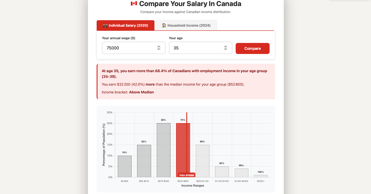
It’s relatively easy to visualize the 1% of the richest people in terms of wealth, but for incomes, it’s harder. We talk about the « middle class » but it’s not really clear what exactly it encompasses.
There are 2 ways to see your position in the income distribution: either individually or by household. The difference comes from the data sources. The first is based on the census made every 5 years, and the second is an annual household survey. The latter is less precise in terms of characteristics (age, percentiles), but the data is more recent.
Also, for the household survey, I had to recompute an approximation of the gross income by re-adding the « transfers paid » (taxes) back into the disposable income. This is not perfect, but it has the benefit of being a good way to compare one’s salary.
I use the gross wages because I think this is what people know better (the salary they have on their job contract) compared to their monthly or bi-weekly pay that can vary depending on the month since some contributions have limits.
I already have some ideas about improving the tool, for example, having the option to adjust the census data based on inflation or a better way to compare pensions for retirees.
I would like to thank Philipp Smith for his initial help clarifying Statistics Canada data. Any errors are my own. The website design and code were generated with the help of Claude Code.
https://compareyoursalary.ca/ (https://comparetonsalaire.ca en français)
Billet publié dans les rubriques Gestion de Produit on